
As part of our course on Digital Product Design, our team was tasked with exploring the onboarding flow of various websites and apps, and then selecting a suitable candidate to redesign. Our team looked at online services like Canva, Strava, and Trade Me, but ultimately decided to go with Letterboxd as it offered the most room for improvement.
Letterboxd is a social platform for film lovers. It was launched as an app focused on sharing opinions about film. Without logging in, users are able to read and share reviews, but to write their own, they must sign up for a free account.
As it stands, Letterboxd's onboarding relies entirely on a single landing page, which is really nothing more than a lengthy marketing piece talking about all the different features Letterboxd has to offer. The user flow to get to this page is seemingly straightforward.

However, rather than guiding users as they interact with these features, Letterboxd uses front-loaded instructions that solely rely on the user to read and figure out for themselves how to use the product. This is problematic because:
Our challenge thus was to reframe how to introduce new users to Letterboxd in a way that makes sense, by using onboarding theory and principles that we'd learned through our best practice research.
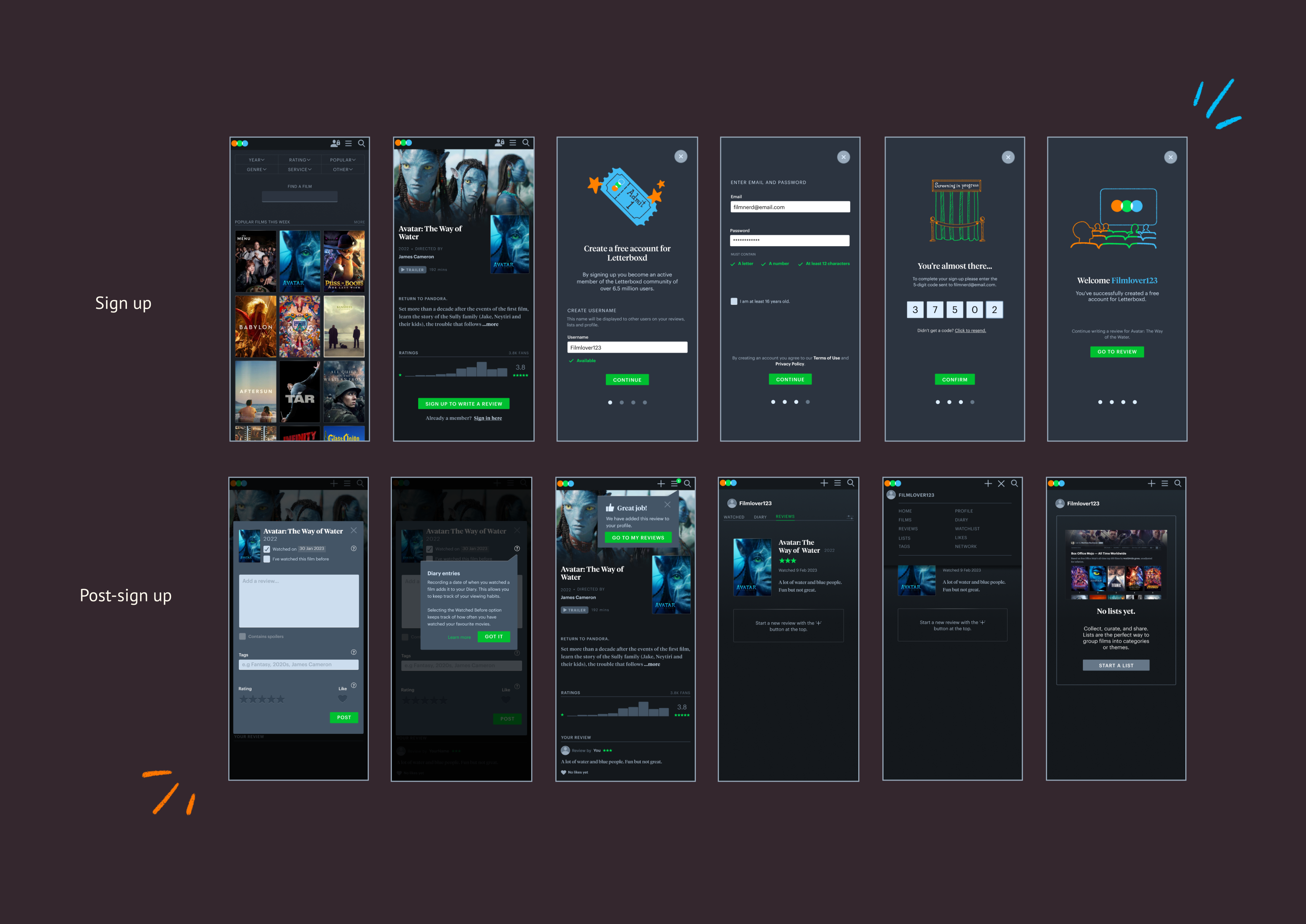
Letterboxd's current sign-up process is only accessible through the homepage and the navigation menu. There are no buttons on other subpages that would allow users to sign up when they are trying to complete an interaction that requires an account.

Upon clicking on one of the entry points users are taken to a signup form.

After completing the sign-up process, users are directed to a lengthy marketing piece that outlines all the features available on Letterboxd.

After the welcome page, users are directed to their dashboard. This is where users are able to track the films they have watched, reviewed and liked, as well as view the lists and members they follow.

As it stands, Letterboxd's onboarding flow failed to provide new users with the necessary information at the correct time.
After several brainstorming sessions, we figured out that for our user flow the goal was to combine the key features of writing a review, creating a movie list and following other users into one onboarding process. The starting point would be the signup form.
Our strategy was to apply a jobs-to-be-done (JTBD) framework that would introduce individual onboarding tutorials with the key function the user may want to complete. After completing the signup users would be asked what task they wished to complete and lead through the according tutorial. This also solved the issue of Letterboxd's ineffective use of empty states. By tying the signup to a task the dashboard is populated and users have something to build on instead of an empty profile.
We also decided that instead of Captcha which is outdated due to AI learning, we chose to use a Multi-Factor-Authentication (MFA) with a one-time-password (OTP). The verification code is sent via Email. This makes the user verify the account immediately so they don’t forget about it.

However, after some initial sketching and wireframing, we realised that we were trying to include too many steps in one flow. Since this project had a tight turnaround time, we decided to streamline our approach. We reframed our flow to a single use-case, chosing to target users who have used Letterboxd before without an account and now wish to explore more interactions - moving from a consumer to a contributor. The key function we chose to explore with our flow was the review form.

While our new flow focused on one specific function we designed the process so that it could be applied to other functions on Letterboxd. Users wanting to create a list for example would be led through the same process.
Once we'd finalised our flow, we jumped into wireframing the lo-fi prototype. Our hypothetical flow was meant to allow users to sign up when they want to write a review. We chose a film's subpage as our entry point. From the CTA users are led through the signup form. Upon completing the signup process users are directed to the review form. This creates a seamless task flow.

For our first round of usability tests we chose to keep the review form the same as it currently is on Letterboxd. After completing the review a success message in a popup appears after a short delay that leads them to their profile dashboard. This is meant to help users locate their reviews and to introduce them to their profile dashboard.

Once users click on the pop up message or navigate over the main navigation to their reviews they land on their profile page. To make it easier for users to write further reviews we utilised the empty space and added a button that allowed them to go straight into writing a new review.

Since we also wanted to explore options of introducing other features that were not included in the signup onboarding, we created short instructions on the empty states. Another change we made was to combine two separate navigations that Letterboxd offered in different pages: The tab navigation and the header navigation with the profile picture. We assumed this would help users navigate their profile page better.
For the lo-fi testing, our objective was to discover whether participants would be able to complete a core interaction-writing a review- after signing up. We also wanted to explore whether they understood the features of the review form, and if they could locate their new review in their profile.
We asked users without an existing account to navigate to a film’s page and write a review for it. Here are our key findings.
Some of the microcopy didn’t accurately reflect the action leaving participants confused.
When looking at their user dashboard, most participants mentioned that they didn’t understand the functionality and need for the diary feature.
Most participants expected to see some sort of visual feedback when entering a password.
Most participants found it odd to have both a ‘like’ button and a rating system when reviewing a film.
Participants had different expectations of where clicking on the ‘+’ sign would lead them.
All participants found the 'tags' input confusing due to 'Netflix' being the example tag. This left them unsure of what to tag the films with.
Based on our findings, we built our hi-fi prototype with certain changes in mind.
We changed a lot of the original Letterboxd microcopy we had used while testing the lo-fi prototype. For instance, we changed the “save” CTA button on the review form to instead say “post” as that was causing confusion in some of our testers. Similarly, we added more suitable sample tags in the tag text field that would better clarify how users could use that feature.

Since all our participants were confused with the features of the review form, we added tooltips to help improve their understanding. We also added “learn more” as a secondary CTA to connect the help section to the tooltips.
For our final round of usability tests, we focused on how helpful the tooltips were for users’ understanding of the different features of the review form. We also tested our use of empty states to introduce other functions in the dashboard that users may want to explore.
The task we provided to users was the same as that of the previous test, with extra attention paid to features tied to our objective. Here are our key findings.
Some participants didn't expect to see the review form as a pop up. One participant mentioned that because there is little screen space on mobile, they would expect the form to cover the full screen.
Participants found the tooltips we provided helpful; Letterboxd’s existing features can be a little confusing at first glance. However, the microcopy needed a little more work before they were perfectly clear.
The inconsistent iconography used throughout obfuscated certain features functionalities, and needed reworking to be more clear.
The navigation system for the dashboard that we reworked turned out to be too confusing for users. Having two rows of navigation was disorienting, and users were unsure how to use them to navigate.
Based on our research and usability tests, we were ready complete our final design. You can view the full prototype here.
Here is a rundown of all the major changes we made, compared to how Letterboxd looks originally.


Since this was a student project, there were a few limitations we had to work around. The main one was time; we had to really narrow down our focus to one use case to keep our workload manageable.
Limited time also meant that we weren't able to find a large variety of participants for our usability tests. We had a total of 11 people participate across two rounds of testing. These participants were people we knew, which led to a non-representative sample.
From our teardown and usability tests, we found issues with the interface and information architecture of Letterboxd which had an impact on its usability. Due to the time constraint and scope of this project, we decided to leave these issues as they were and focus on how we could make it more understandable for users through our onboarding.
This project was really rewarding to work on. It got me thinking about an aspect of digital product design-onboarding- that I'd never given much thought to previously. Conducting teardowns on various sites and apps and analysing what makes good or bad onboarding was really interesting.
Though this assignment focused on just onboarding, it also got us to think about other aspects of the digital design process. As mentioned previously, the time limitations forced us to really narrow down our scope. However, if our group had had enough time, there were definitely other areas we wanted to further explore. For instance, we wanted to further explore more use cases, as we had initially planned to in our lo-fi phase. We also wished we could've further worked on the tool tips feature, as our participants had found them especially helpful during testing. Other small considerations we had included making sure colour contrasts met web content accessibility guidlines and redesigning the contents of the help section.
Overall, this project was a really valuable lesson not just in onboarding, but also managing expectations and controlling the scope of a project within the bounds of what is realistic based on available time and resources.

UX Designer • Artist • Daydreamer