Generate Zero’s carbon accounting software, Footprint, was scaling fast, but the product team faced a few recurring challenges. The platform’s UX was inconsistent, with fragmented design patterns, unclear navigation, and little documentation to guide future work. The team also needed to ship new features quickly, often without the time or resources for thorough user testing. These gaps made it difficult to scale effectively while keeping the product intuitive and accessible.I was brought on board to work on Generate Zero's carbon accounting software, Footprint. During my nearly three month tenure I was responsible for designing interfaces for upcoming features, documenting any research I did, and bringing consistency and organisation to their current design system.
I joined as the sole UX/UI designer for a 3-month period, embedded in the team’s two-week Agile sprints. My responsibilities involved:
Delivered new features under tight sprint deadlines, enabling smooth developer handoff and reducing.
Strengthened patterns, colors, and tokens, improving scalability and consistency across core components.
Captured research and rationale clearly, cutting future ramp-up time and ensuring long-term continuity.
I joined the product team’s Agile sprints, syncing with the dev team and working in two-week cycles on a live platform with fast turnaround expectations. Joining a live SaaS product team as a junior UX designer meant facing tight deadlines, limited resources, and minimal user testing. Here’s how I approached each challenge:
Delivered high-fidelity designs quickly by leaning on existing design patterns and focusing on clarity and consistency.
Collaborated closely with developers and the data team to validate feasibility and align design with business priorities.
Used heuristic evaluations, desk research, competitor analysis, and best practice patterns to inform design decisions.
Extensively documented every design choice to support continuity for future designers and developers.
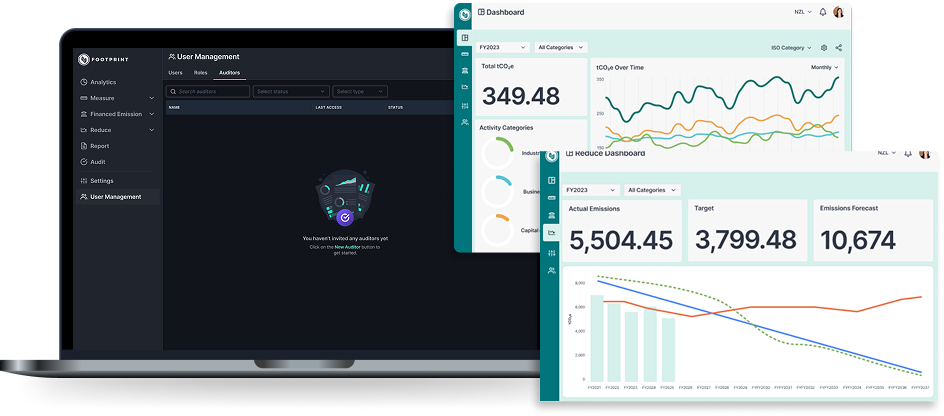
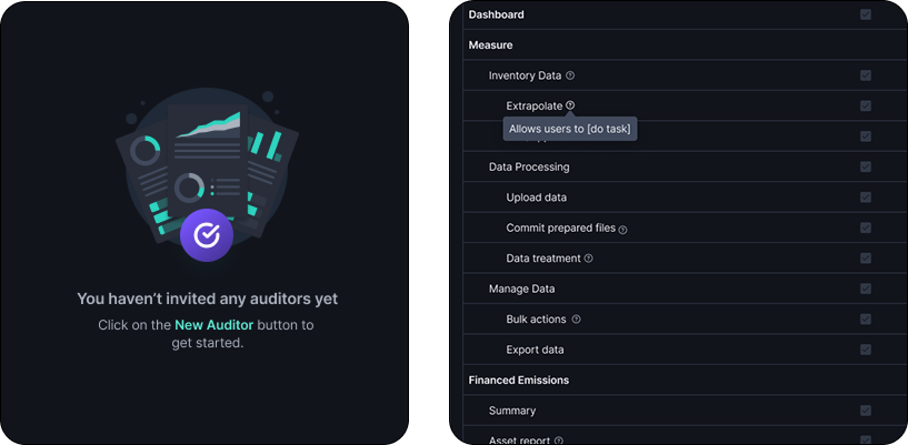
When new customers set up their accounts, they needed assistance from a data engineer, thus putting undue stress on the product team as resources were being split in unproductive ways. The purpose of this project was to simplify set up by empowering new users to set up and configure the platform independently.. There were two major areas I worked in:
Many input forms were long and cluttered. Working with a data analyst, I collapsed less-used inputs into an “advanced settings” dropdown and pre-filled likely defaults, reducing compulsory fields by 50%. This reduced users’ cognitive load and allowed them to decrease time spent filling out tedious but necessary forms.
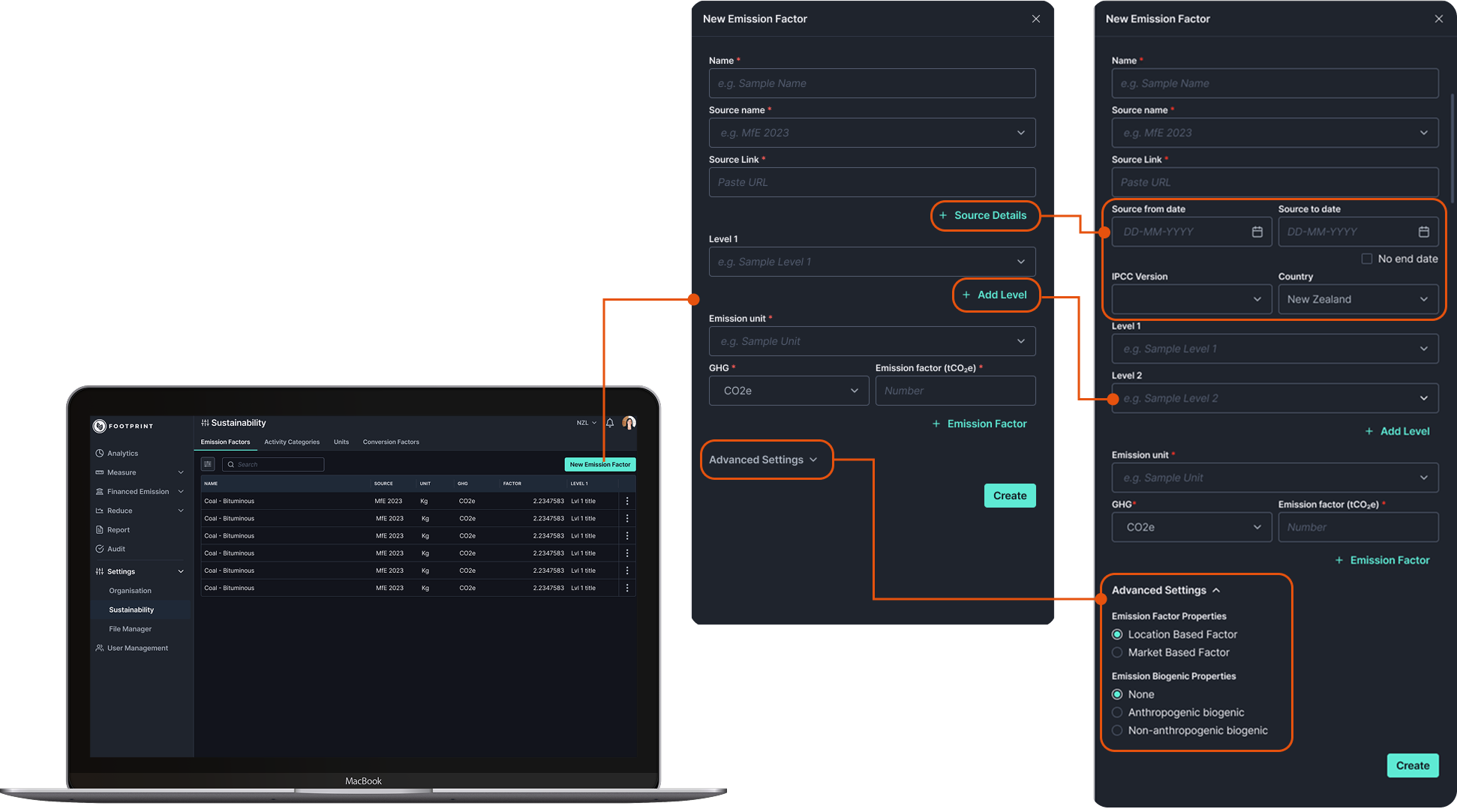
Some terms were unclear even for experienced users. I added on-demand information through tooltips, contextual microcopy, and strategic empty state designs, making the settings pages easier to navigate and reducing reliance on the data team.
Chasing suppliers for complete sustainability reports during audit season was time-consuming for customers and caused delays. The goal of this project was to streamline the process and prevent penalties from incomplete reporting. To inform this feature’s design, I approached the problem in two steps:
I explored early designs by conducting competitor analysis on supplier integrations, making a note of the differences in functionality on each platform. Based on my analysis, the major feature to emulate was streamlined supplier engagement with automated or guided data submission, as seen in Watershed and Avarni, which reduces back-and-forth communication and ensures timely reporting. Most other platforms, including Persefoni and Microsoft, focused on data tracking and analytics but offered less intuitive tools for supplier interaction, highlighting an opportunity to make the process easier for customers.
I then mapped two user flows, on the customer and supplier sides to capture the end-to-end experience. Users could batch request information from all their suppliers, who then just had to upload information without having to make a new account, which was a major pain point at the moment. I then unified the two flows to focus on the customer end, and using information from the supplier side to guide. This reduced projected dev effort by focusing on customer-side MVP first, while keeping supplier-side expansion feasible.
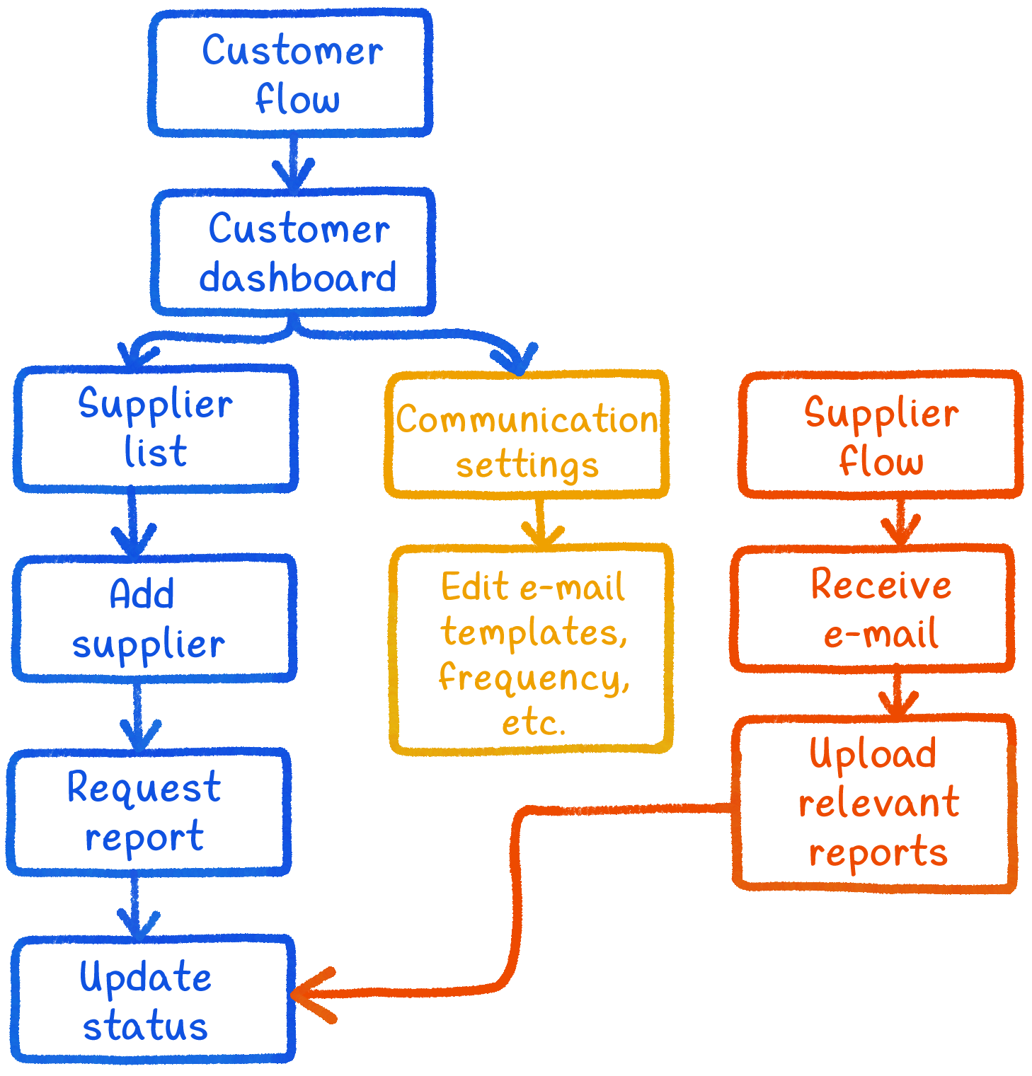
This concept set the foundation for reducing wasted time during audit season, streamlining supplier collaboration, and lowering the risk of customers facing penalties from incomplete reports.Since this feature was not being immediately implemented, I future-proofed my design by documenting my process, research, and design rationale so that there was a base for the next designer or developers to work from, helping reduce ramp-up time for future designers.
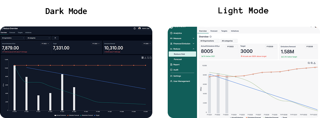
Several customers had requested a light mode, and accessibility standards needed to be met to make the platform usable for everyone. This project was not just cosmetic — it aimed to improve readability, reduce eye strain, and give users personalisation options while maintaining consistency across the platform. There were three main steps to this project:
Worked with a developer to audit the entire platform using the A11y colour contrast checker, ensuring all components met accessibility standards. I also reviewed the existing dark mode components and updated them where necessary.
This concept set the foundation for reducing wasted time during audit season, streamlining supplier collaboration, and lowering the risk of customers facing penalties from incomplete reports.Since this feature was not being immediately implemented, I future-proofed my design by documenting my process, research, and design rationale so that there was a base for the next designer or developers to work from, helping reduce ramp-up time for future designers.
Built upon the previous UX designer’s work to fill remaining gaps, ensuring a coherent and usable light mode experience across all pages. Also added detailed notes for each colour use case and labelled colours with a self-explanatory token system to guide developers. This provided a clear foundation for future personalization options like theme switching or custom color preferences.
Customers gained an accessible, readable, and personalisable experience, while the platform maintained a consistent design system. Developers had clear guidance, reducing errors and speeding up implementation.
Working at Generate Zero gave me invaluable experience contributing to a live SaaS product under real-world constraints. Key takeaways include:
Delivered features without full user testing by leveraging heuristics, competitor insights, and close collaboration with developers and data engineers.
Aligned design with technical and business requirements while ensuring usability, accessibility, and scalability.
Created clear rationale and system-wide guidance that allowed my work to be implemented smoothly and set a strong foundation for future product improvements.
Seeing my designs move from Figma to production built confidence in my ability to solve real problems and add value in a team environment. I left Generate Zero better equipped to design at speed, advocate for accessibility, and think at both feature and system levels.

UX Designer • Artist • Daydreamer